# Overview
The App Designer provides for the creation and management of rich web applications through an intuitive drag and drop designer interface. Applications are comprised of pages with layouts, and widgets which provide various dashboard and interactivity features.
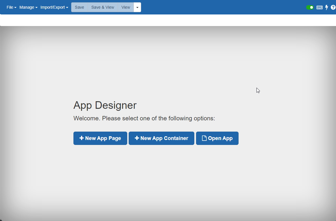
The App Designer is accessed from the applications Administration menu under “App Designer”. The landing page for App Designer provides prompts to start a new App Page, new App Container, or open an existing App .
# Creating an App
When building a new app, consideration will need to be made for how the App will be accessed, and how it will be shown to end users, or “drawn”. Apps can be made available as new pages within the PMG Portal, or can be defined as a collection of one or more App Pages which are drawn within an App Container. An App Container acts as a visual container for one or more related App Pages, with the container controlling aspects of the overall App including permissions, navigation, and global widgets made visible for all App Pages.
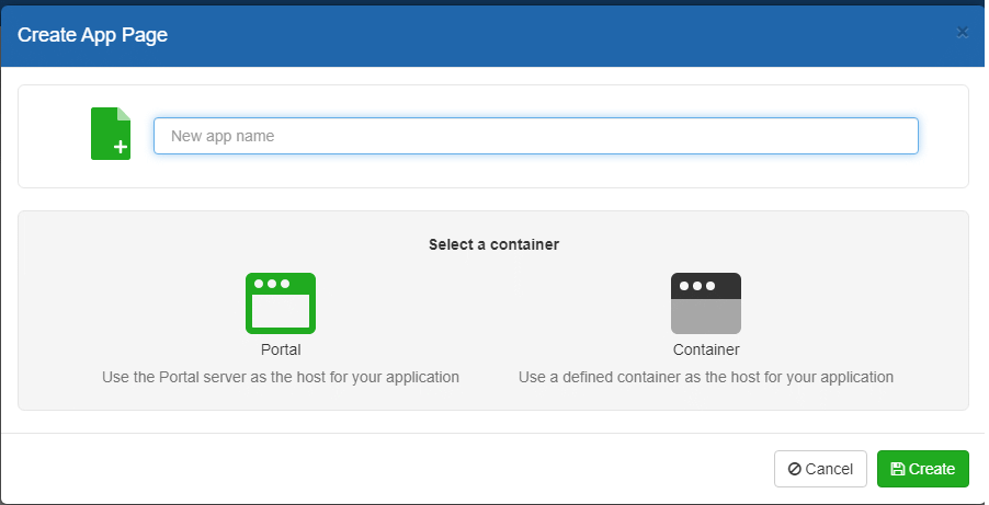
To create a new App, access the App Designer from the Administration menu. After selecting "New App Page", the following is shown.
When prompted, provide a Name for the new App, i.e., MyApp, and choose if the App will be rendered within the Portal, or in a container. If "Container" is selected, a list of existing containers is provided to assign as the container for the new App page.
On creating or loading an existing App, the App Designer will load. The App Designer is comprised of a menu bar to manage various aspects of Apps, their lifecycle, and App related content. Below the App Designer menu bar is a “Configuration” tab and “Design” tab. Configuration allows for setting of various App options and behaviors. The Design tab provides a visual designer for the layout of the app, by dragging in widgets and setting their configurations.
# Creating a Container
An App Container is an App Page that can act as the "outer portion" of an App Page. You can think of it like an "App" that has "pages". The container allows for creating a shared layout as a common landing page. The container layout can be used to setup and style a header, footer, and/or sidebar with one or more app pages embedded within the container.
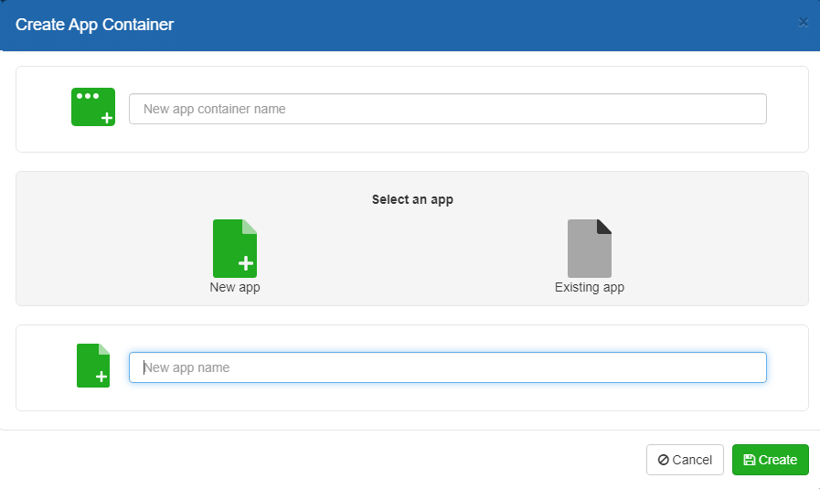
If you are creating a Container, you can provide the container name along with either a new App Page or existing App Page to be the initial App Page hosted within the new container.
# App Designer - Configuration
To start an application, begin by reviewing and setting the Configuration properties.
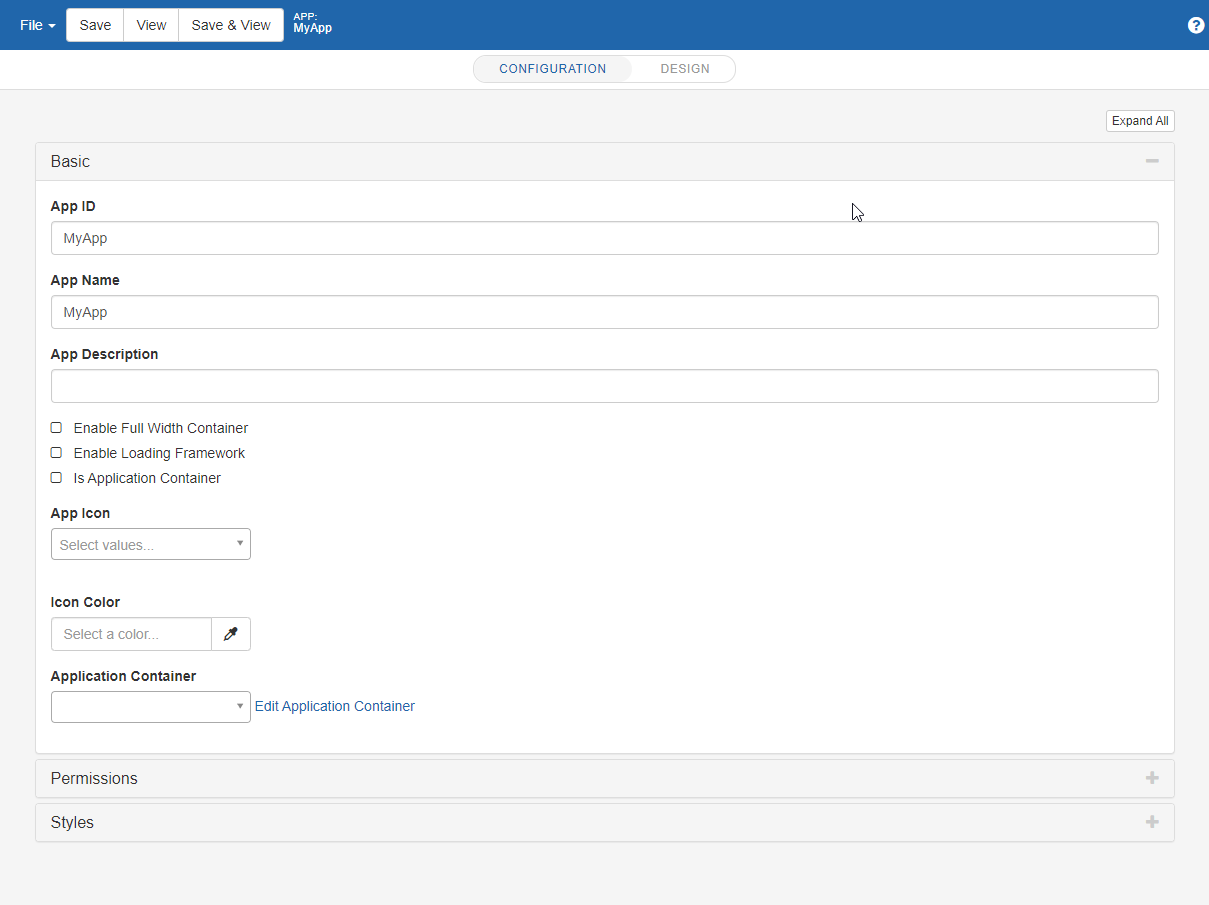
App configuration offers the following options.
# Basic
App ID: A unique identifier for the application
App Name: A descriptive name for the application
App Description: A description for the application
Base layout behaviors
Enable Full Width Container: Determines if the application will span the full width of its outer page, when embedded. An app is embedded when no application container is selected.
Enable Loading Framework: Determines if widgets will be hidden until fully loaded. When enabled a loading indicator will display while widgets are being drawn. See the system setting LOADING_FRAMEWORK_TIMEOUT which globally sets the maximum wait time for the loading indicator.
Is Application Container: Establishes if the current application’s page will be used as a container for additional application pages. Application containers can control the layout of a collection of App Pages, providing menus, headers, footers, or other widgets for an application, and will also load App Pages in a designated content area. By leaving this option disabled, the page will either run directly from the PMG Portal, or indicates it will be embedded in some other Application Container. This option controls an additional option. When selected, the “Home Page” option becomes available, replacing the “Application Container” selection.
Is Featured: Specifies the page as "featured". Featured pages can be searched for and rendered on a page using the App Container widget.
Enable PWA: determines that the app page is installable as a PWA.
App icon: Specifies an icon for the application to be used when referenced from other widgets
Icon Color: Specifies an override color to use with the selected App icon when displayed
Application Container: Specifies an outer application page which will draw this app. This option is displayed when “Is Application Container” is not selected above.
Home Page: Specifies which App Page will be loaded by default when the App Container is loaded. This option is shown when “Is Application Container” is selected above.
Widget Copy/Paste The quick keys Ctrl+C and Ctrl+V may be used to copy/paste the selected widget. Pasting a widget into an empty placeholder can be accomplished by focusing on the target placeholder. Widgets may also be pasted in between existing widgets on the page by selecting a widget. If a widget is selected, the copied widget will be placed directly after the selected widget.
# Permissions
Applications can be secured with permissions. Any number of users and groups can be selected to be able to access the application. Permissions include the option for “Can Edit” which determines if the user or group may also edit this App definition.
Permissions applied to an App Container are applied to individual App Pages that the container references, unless more specific permissions are applied to an individual App Page.
# Styles
Allows for app specific scoped CSS
# JavaScript
Allows for app specific scoped JavaScript.
# App Designer - Design
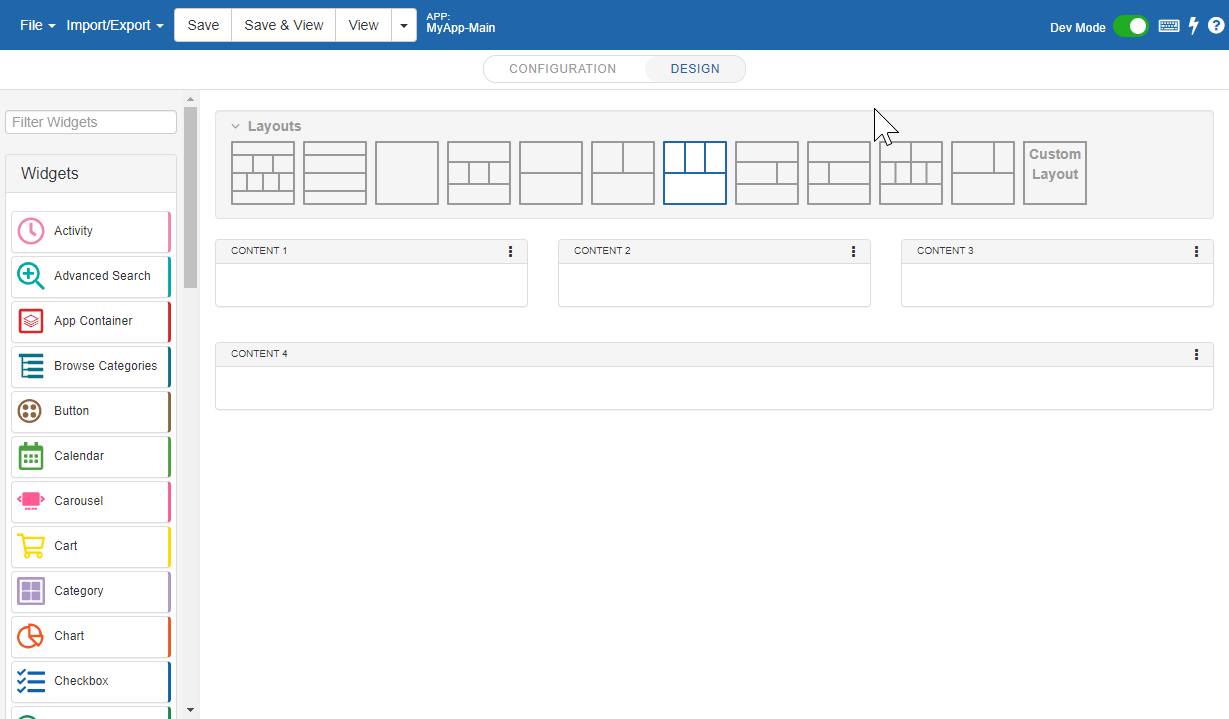
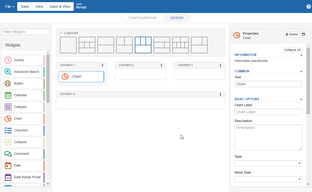
Applications are built with the design mode of the App Designer. The Design mode screen provides a menu bar with options to create, manage, and deploy apps. Design mode contains a “Widget Palette” on the left side from where widgets can be dragged from the palette into the target “Content” layout targets provided. The Layouts section allows the designer to select a layout for the app or build a custom layout. Layouts contain various styles of page structure with target areas for “Content” to determine how widgets will be drawn as the application runs. The designer will different options based on the app page type, per below.
App Page Layout - These pages will be loaded from either the PMG Portal, or from another App Container.
App Container Layout - These layouts are only available to pages that have been configured as Application Containers. Like page layouts, they define content zones for widget placement, but they also contain a content section where another App Page will be embedded.
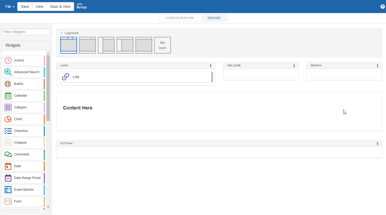
Layouts - Within the App Designer, layouts provides a palette of page layout options. Layouts includes elements such as margins, the number of columns, how headers and footers appear, and more. Layout choices will vary based on the App type, “App Container” or “App Page”.

When viewing the layout, you can select the widgets or the content areas to display a related properties panel on the right.
# Content areas properties
Accordion – indicates the target display area will support CSS accordion behavior. Widgets within the section which support being collapsed will display an expand/collapse in their own title bar.
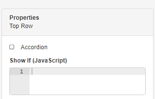
Show If (JavaScript)
Defines optional custom JavaScript which controls if the content area is visible. The code should return a Boolean, true or false. The code can reference values of other widgets in the page by referring to the widget name per below.
pageVm['Select Color'] == "Red"
pageVm['Users'].length > 0
# Custom Layouts

The Custom Layout allows the user to define a custom layout based on specific requirements. Custom layouts are defined either with custom HTML, or using the Layout Builder. To create a custom layout, select "Custom Layout", then click "Edit".
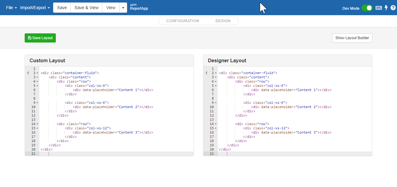
By default, the Custom Layout shows the HTML for the current selected template, and you may make any edits needed for this page.
# Layout Builder
The Layout Builder provides a visual interface to specify the page layout. To use the builder, select "Show Layout Builder".

Layout Builder controls are as follows:
Save Layout - Saves the current layout
Add Row to Layout - Provides a set of predefined rows with column options to add to the current layout.
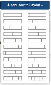
Select a row option provided and a new row will be added to the page layout.
Re-ordering rows
Rows may be re-ordered by drag and drop, by clicking and dragging the row to a new location
# Adding Content to Rows
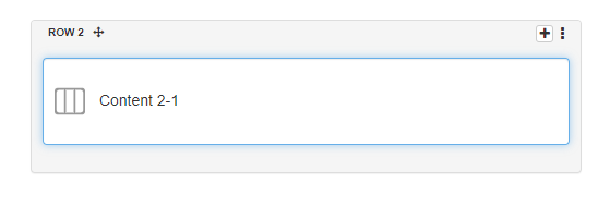
Content areas hold the content widgets. To add a content area to a row, click the "+" icon on the top right of the row. Content areas then can be selected to manage their properties in the displayed properties panel.
# Layout Properties Panel
The Properties panel shows options for Content Areas and Rows. Select either a content box or row to view the property panel on the right.
Rows may be renamed using the Property Panel.
Content Areas may be renamed, and their responsive size may be specified as well, using the "Size on medium devices" property.
# Viewing and Debugging Apps
To enable debugging features while viewing Apps from the App Designer, toggle the "Dev Mode" on while in the App Editor.
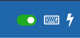
When Dev Mode is enabled, viewing an app from the App Designer will make available additional debugging options accessible from a floating menu.
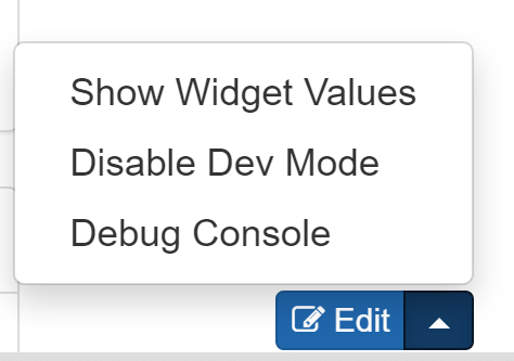
Show Widget Values will display the raw data value of each of the data widgets in the current app page.
# Debug Console
The debug console provides a rich view of information about the widgets within a page including the data flowing to and from each widget along with the data source information. Each row of the console provides information about a widget, including the execution time details and the details of the data sent to and from data workflows.
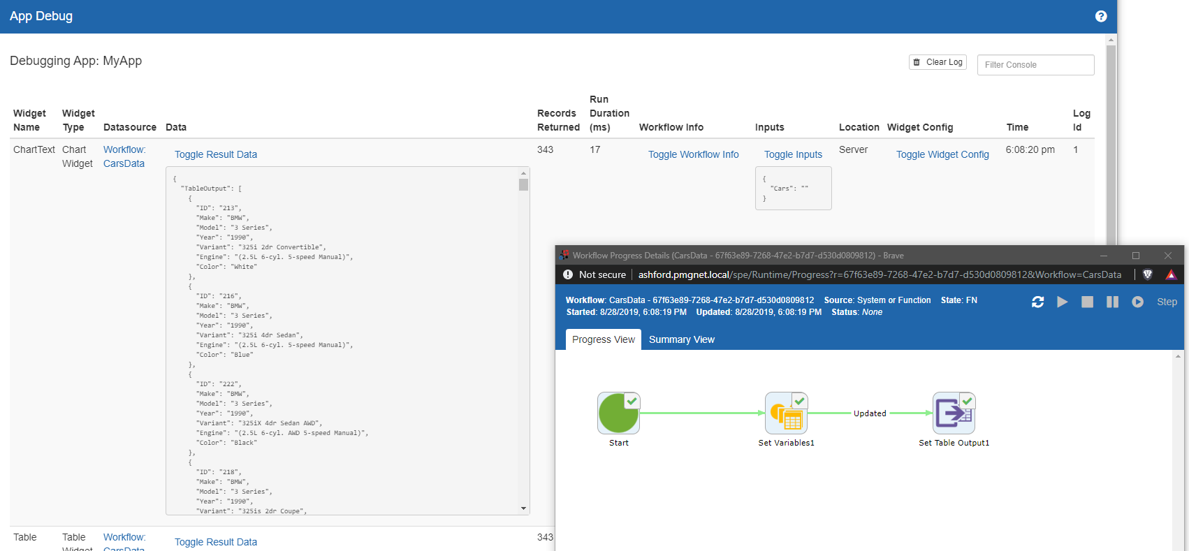
Diagnostic data includes the following.
Datasource - Information about the source of data for the widget. In the case of data workflows, a link is provided to display the workflow execution details.
Data – the returned data from the data source may be viewed in its entirety by selecting “Toggle Result Data”
Records Returned – The number of rows of data detected
Run Duration – The time the data source took to return from start to finish
Workflow Info – provides an execution summary of the ran workflow
Toggle Inputs – displays any input parameters that were passed to the data workflow
Location – Indicates the source of the data for the widget
Widget Config – displays the raw underlying JSON configuration document for the widget
Time – The timestamp of the widget loading start
# App Lock/Unlock
The App Lock/Unlock feature allows users to lock apps to prevent other users from editing the app in the designer. Locking an app does not prevent it from being updated via web services or package manager. System/Catalog admins can unlock apps locked by other users. This can be useful if a user forgets to unlock an app before going on vacation.
The modal to lock and unlock apps can be accessed via the manage menu or by clicking on the lock/unlock/locked icon that is displayed in the upper right hand corner of the designer.
![]()
The icon in the upper right corner will change depending on the locked status of the app. If the app is locked by you, a check icon will be displayed. If the app isn't locked, an unlocked lock icon will appear. If the app is locked by another user, a lock icon will be displayed. Hovering over the icon will trigger a tooltip describing the lock status of the app.

# Accessing Apps
Apps are saved by clicking “Save” on the toolbar. From the Toolbar, View/Save & View will also load the saved App into a new browser window target.
Clicking View > Mobile View will load the App inside of a preview screen that allows you to interact with the App as if it were loading on a mobile display.
Alternatively, to access a defined application directly in a browser, access the app with the below URL accordingly
Application pages without an application container (loaded within the Portal):
<baseurl>/sc/app.embed.aspx?app=<pagename>
Application pages with a container:
<baseurl>/sc/app.aspx?app=<pagename>
Each time an App is saved, a new version is created.
Application Containers - Application containers define a layout. Application containers can be thought of as a wrapper that defines a standard header, footer, and CSS styles for all pages that reference it.
CSS Styles - CSS is a stylesheet language used to describe the presentation of a document written in HTML. CSS Styles describe how elements on a page should be rendered on screen.
# Widgets
Widgets - Are pre-built components that perform a function such as rendering a report table, drawing a chart, or displaying a link. Widgets can be informational or interactive, and can share information with each other, allowing for simple to advanced applications. Widgets interact with workflows to retrieve data to display or can send data to workflows to initiate an automation activity.
One or more widgets may be placed into the available content areas as below.

As widgets are selected, their respective properties panel will display within the designer to the right side where all the available options may be set for the selected widget.
# Widget Data Sources
Widgets can often use data from other sources in the application. These widgets provide a “Data Source” property which allows selecting a type of source and details about the data being returned. Data workflows can return data in various formats. Options include string, JSON array, JSON document (of any structure), DataTable result, a simple primitive type like int or bool, and others. Note: When working with returned data, column names are case-sensitive.
Data Source properties provide the following options
Use URL Parameters: URL Parameters will be handed into data workflows. URL parameters will be handed to the invoked workflow by matching workflow variable names.
Source: Workflow, Report Builder, URL, SQL
Based on Source, the below choices are available
SQL: When SQL is selected, the Query Builder is available which provides a visual interface to build the query to return data. Please see the Query Builder section for additional details.
Workflow: When workflow is selected as the source, a list of deployed workflows which can return data are presented. Data workflows are determined by loading workflows which contain a “Data Table Output” action. When a workflow is selected, a preview of its output will be displayed below. Workflow data sources offer the below additional properties.
# Data Workflow User Context
When data workflows are called from a widget, the data workflows are ran as the current active user. Additionally, workflow functions can be ran as the active user session with the following:
The system setting SEND_API_SESSION must be set to "True" to provide the user session information to workflow functions.
Workflow Functions then should have the following settings.
Run As User: Authenticated User
Then the Permission should allow for the dynamic User ID and ignore the API Key with these entries:
UserId: *
API Key: *
Note: API Key can also be restricted, and widgets can provide the API key through its URL parameter setting.
Example URL:
&_authKey="c31e2416-1f47-3777-db0b-5c9df45b9414"
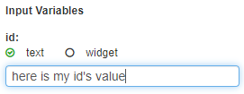
Input Variables: When a workflow is selected, its variables are shown as a list of inputs available to be set when called by the widget. Each workflow input value can then be defined as text or to get its data from another widget. Options are below.
Text: If text is selected, enter the text string to be handed to the workflow.
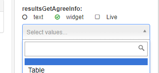
Widget: Select one of the other widgets in the page in the select list. If widget is selected, then “Live” is a choice to have every change of that widget trigger this widget to reload with the new data. Otherwise, the user will instead select a button to trigger this widget to reload.
Report Builder: Reports which are defined through Report Builder are available as data sources for widgets.
URL: URLs which return JSON can be used as a data source by supplying the URL to return the data. Typically, URL is reserved for internal PMG application URLs providing specialized tasks, such as returning session data.
Example URL for session data: /sc/api/session/getbykey?name=XXXX
Replace XXXX with the session data, such as UserId
SQL: Querys can be written to directly retrieve data from a database.
Source: The source option allows the selection of a PMG Core database (PMGSPE/PMGSC). If the environment contains external database connections, these will also be available for selection through the "Source" dropdown.
Data/Query: This text area is the input for a SQL query. Custom variables may also be defined here for use, allowing another widget's change in value to be dynamically used within the SQL query.
Custom Variables - To define a custom variable for use, simply wrap your variable's name with double curly braces.
SELECT [columnName]
FROM dbo.[tableName]
WHERE [columnName] = {{MyVariable}}
Session Variables - Session variables are also available for use directly within the SQL query.
SELECT [columnName]
FROM dbo.[tableName]
WHERE [columnName] = '__USER_ID__'
- __USER_ID__
- __USER_SAMACCOUNTNAME__
- __USER_EMAIL__
- __USER_DISPLAY_NAME__
- __USER_FIRST_NAME__
- __USER_LAST_NAME__
- __USER_LOCALE__
Clicking on the screen outside of the Data/Query will populate a list of all variables found within the query (session variables are directly replaced and will not be available to edit their values). A direct value can be assigned in the corresponding text box, or widget triggering can be used to populate this value when using a widget's "live" option.
An example of a custom variable who's value is populated based upon the change in value of another widget on the page.
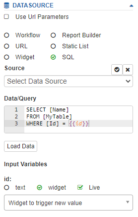
An example of a custom variable who's value is static. This allows for quick testing of the SQL query.
Previewing data: As a data source is selected, a preview window of the data to be returned will be shown to assist in the widget validation and design.
# Conditionally Showing Widgets
Widgets can be configured to show conditionally based on the value of other widgets on the page.
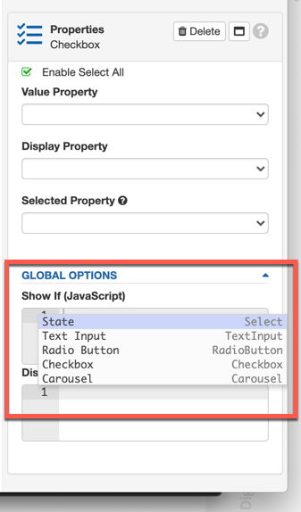
As of v20.1, all widgets contain a Global Options property. This property allows app designers to define a condition for the widget to display. Once a condition is specified, the widget will be hidden by default.
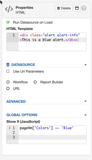
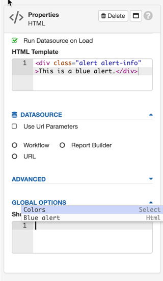
Pressing CTRL + space in the editor will render the lists of widgets on the page. For widgets with data sources that return objects, JSON dot notation can be used to reference individual columns.
# Conditionally Disabling Widgets
Widgets can be disabled conditionally based on the value of other widgets on the page. The "Disable If" property allows app designers to define a condition in which the widget is disabled. By default all widgets are enabled.
Supported widgets include:
- Text Input
- Select
- Radio
- Checkbox
- Button
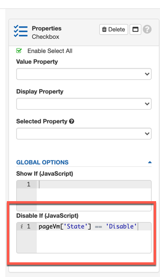
Pressing CTRL + space in the editor will render the lists of widgets on the page. For widgets with data sources that return objects, JSON dot notation can be used to reference individual columns.
# App Pages – Import/Export
One or more App pages may be exported and imported from the App Designer menu, Import/Export, Pages. To export one or more pages, select the Export tab and check each app page to export. To import App pages, select the Import tab, choose the file to upload, and select the App pages to import. When a selected app is open in the App designer, you may also export the current page from the Import/Export menu.
# Apps and Forms - Similarities and Differences
Apps and Forms have some overlap in usage, as App pages can leverage form field widgets, as well as full embedded forms, and both Apps and Forms can query real time data and leverage workflows. Forms largely support one of two roles, the "Service Request" and also as a component of a larger App.
# Service Request Forms
Forms provide the principal component of a requestable service as a one-to-one relationship between a request service and form. Forms are largely composed of a set of form fields. In a service request, the UX is typically that a user will navigate to a request service which will render a single form to be submitted. On submit, the form will call a request workflow and provide additional request services like request history. In this case, the request user experience is largely transactional. The user submits a request form, and the history is then trackable like an online eCommerce shopping experience. Forms are robust and provide support for loading data based on conditions, and can leverage inputs to render based on situational needs, or make calls to look up data to render based on queries. While forms can contain other form segments, Shared Forms, to draw, they are still in large part, a “single form only”. Forms can contain up to hundreds of fields, and in this way, “apps” are achievable using service request forms, but the layout options are limited, typically within the service request form itself, as in this mode, forms are supporting the request process.
# Form Widgets
Second, Forms are also able to be used as components, or widgets, via the “Form Widget” within an App page. When used as a widget, any number of forms can be integrated into an app, along with other widgets, and provide a much broader user experience.
# Apps
Apps support a much broader scope of user experiences, intended to support stateless or stateful UX. For example, while request forms could capture any number of project requests, an app provides more layout and interaction tools, and is well suited to provide a “project management” user experience, where the user might want a dashboard of project data along with various data management or workflow related tasks. Apps provide full page layout control and can incorporate any number of widgets, including Forms. App state management is provided through various means, primarily, in that app pages and widgets, like forms, can be handed inputs, leverage information about the user or user session, and can query data on demand, along with sharing information between widgets or apps. App pages and widgets offer additional means to manage the display and to leverage other state management functions. For example, app widgets provide various OOB data integration and data sharing features, like linking widget inputs, which can be used with data workflows or data queries. In addition to built in integration, widgets and app pages offer extensibility through custom JavaScript, for example through the widget’s Advanced or Global options in “Show If (JavaScript)” and Widget Loaded (JavaScript). An App Page Configuration tab provides for custom or particular page layout and custom functions through its Styles and JavaScript properties.
# Widget Palette
The below widgets are available from the widget palette
# Activity
The Activity Widget provides a view for a single Service Request, which includes history and its current state. The widget picks up the Service Request from the “order_number” parameter of the URL of the outer page which loads the widget.
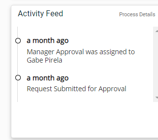
The widget has the below properties.
Text – Defines a text label for the widget when displayed
The below JavaScript function provides an example of a link that would replace the shipping request summary page with an App Page, containing an Activity Widget. This script would be defined in /sc/ThemeAdministration/CustomJavascript.aspx
/*TO LINK TO THE REQUEST DETAILS PAGE FROM CHECKOUT SUMMARY*/
$(function () {
    $("a[href*='checkout.summary.aspx']").attr('href', function () {
        var href = $(this).attr('href');
        return href.replace("checkout.summary.aspx", "/sc/app.embed.aspx?app=request-summary&");
    });
    $("input[onclick*='checkout.summary.aspx?']").attr('onclick', function () {
        var onclick = $(this).attr('onclick');
        return onclick.replace("checkout.summary.aspx?", "/sc/app.embed.aspx?app=request-summary&");
    });
});
# Advanced Search
This widget provides searching features around a data source and provides several convenience features to the end user to allow categorized filtering through a table to find results. For a specified data source, the widget will support building categories of data dynamically from the source table values. For example, a table of automobile inventory could return makes, models, and colors in different columns. These columns can then be turned into filters to help the user select through the available data. URL parameters can drive filter behavior if URL parameter matches name of the filter.
Below is an example of the widget for a database of cars.
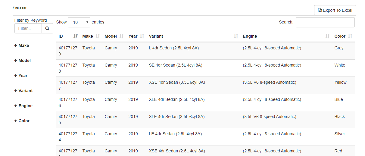
In addition to the categorized filters, the user can specify additional search terms to further filter down the list of matches.

The widget has the following properties.
Display Name – Provides a text label for the widget which is used as the displayed name while viewed in both the layout design and view pages.
Mapping Name - Provides and internal name which is referenced by the global options Disable If and Show If.
Basic Options
Excel Export – Provides an excel download link
Enable Date Filter – provides a time selection range which will be passed to the called data workflow into a fixed workflow input as “daysago” and the value will be a number of days. The called workflow can make this input available and then use within its logic to properly limit the results.
Format Dates - If the column name has “date” in it, the value will be shown as a formatted date.
Data Source – A data workflow will be executed on button load and on button click.
Advanced
Hide Columns – A comma separated list of column names to hide for the returned data source
Hide Filters – A comma separated list of column names to hide from the auto-generated filters
List View - Render each item according to the HTML in the Item Template.
Link Column Name – The column to turn into an interactive link
# App Container
The App Container Widget will display available Apps as a type of launchpad or menu for users. Options for the widget are below.
Basic Options
Display Name – Provides a text label for the widget which is used as the displayed name while viewed in both the layout design and view pages.
Mapping Name - Provides and internal name which is referenced by the global options Disable If and Show If.
AppContainer/Page – All Containers, All Pages, or Featured Pages - controls what the widget will display
Enable Carousel - Enabling this setting will place the returned data into a scrollable carousel which can rotate through the available application containers. When this setting is enabled, the properties section “Carousel” is exposed allowing further control over the carousel's functionality:
Enable Touch Drag - Option to enable touch drag to scroll through items in the carousel (mobile devices).
Enable Mouse Drag - Option to enable mouse drag to scroll through items in the carousel.
Enable Navigation - Option to enable navigation arrows to scroll through items in the carousel.
Enable Loop - Option to enable infinit looping through carousel items. When the end of the items list is reached scrolling will continue starting again with the first item in the carousel.
Margin - Specify the space between items in the carousel, measured in pixels.
Items - Set the number of items to display in the carousel. This option does not limit the total items in carousel and only limits the number of items displayed.
Enable Sorting – Provides the ability to sort the available application containers between ascending and descending
Advanced Options
HTML Template – Provides an HTML and Mustache template for controlling the display of the App Container
# Button
The Button Widget provides a button control for the page which allows the user to trigger configured events. This can be used to gather values on the page to submit to a workflow, or to trigger the refresh of other widgets. This widget has the below configurable properties.
Data Source – When clicked, the button will call the data workflow and will hand in any configured input parameters. The called data workflow can set the “value” for the button to use by returning a value from the workflow. The value of the button can then be used as a trigger to other widgets.
Display Name – Provides a text label for the widget which is used as the displayed name while viewed in both the layout design and view pages.
Mapping Name - Provides and internal name which is referenced by the global options Disable If and Show If.
Refresh Widgets – a list of widgets to refresh when the button is clicked
Style - provides a select list of CSS styles for the button
Size - provides a select list of CSS sizes for the button
Icon – provides a select list of CSS icons to apply to the button
Icon Placement – provides a select list of CSS placement options to apply to the button
Full Width – Applies a style to indicate the button should use the available width in its container
Align Horizontally – Indicates CSS rule for horizontal alignment will be applied
Use SweetAlert – Uses SweetAlert as a display alternative to the default JavaScript pop-up
SweetAlert Type – specifies a style for the alert to display
SweetAlert Text – specifies the text to display on the alert
Click Event (JavaScript) – Specifies any additional JavaScript to be ran when the button is clicked and any configured workflow returns, e.g. show a modal, or any other special logic.
An example JavaScript for the button action is below. In this example case, on button click, the browser would redirect to the defined page.
location.href='/sc/account.history.aspx'
# Calendar
The Calendar Widget displays a calendar with event information coming from a data source. Options for the widget are below. This widget is drawn with https://fullcalendar.io/ and is compatible most of its APIs and data formats. An example of event data for the widget is below.
[{
    "title": "Flow 1",
    "start": "2017-10-16T16:49:52.603",
    "end": "2017-10-16T17:49:52.603",
    "url": "/spe/Runtime/Progress?r=1"
}, {
    "title": "Flow 2",
    "start": "2017-10-16T16:49:52.603",
    "end": "2017-10-16T17:49:52.603",
    "url": "/spe/Runtime/Progress?r=1"
}]
Note: When defining a clickable link for each event on the calendar, the “url” parameter from the data source’s returned data is used. The “url” parameter in the above data defines the href attribute for the HTML anchor tag of each displayed event.
Common
Display Name – Provides a text label for the widget which is used as the displayed name while viewed in both the layout design and view pages.
Mapping Name - Provides and internal name which is referenced by the global options Disable If and Show If.
Indicate Current Time – Whether or not to display a marker indicating the current time.
Content Height – Specify a fixed height for the widget. By default, blank for auto-height.
Views – a multi-select list of views for the calendar; month, agendaWeek, agendaDay, listWeek
Get Events Data Source – Defines the data source to return values to show as events in the calendar Advanced Options
Display All Day Row – Determines if the “all-day” slot is displayed at the top of the calendar in Agenda view.
Enable Business Hours – Emphasize a view’s “business hours” (aka “working hours”). By default, Monday - Friday, 9AM - 5PM.
Enable Valid Date Range – Limits which dates the user can navigate to and where events can go.
HTML Template – Provides override HTML to support custom layouts for events displayed on the calendar
# Carousel
The Carousel Widget displays data retrieved from a data source and displays the data in a carousel which can rotate through the items.
Common
Display Name – Provides a text label for the widget which is used as the displayed name while viewed in the layout design page.
Mapping Name - Provides and internal name which is referenced by the global options Disable If and Show If.
Enable Touch Drag - Option to enable touch drag to scroll through items in the carousel (mobile devices).
Enable Mouse Drag - Option to enable mouse drag to scroll through items in the carousel.
Enable Navigation - Option to enable navigation arrows to scroll through items in the carousel.
Enable Loop - Option to enable infinit looping through carousel items. When the end of the items list is reached scrolling continues returning to the first item in the carousel.
Center Items - Option to center the item being displayed in the carousel.
Enable Auto Play - Option allows the carousel to automatically scroll through items.
Enable Pause on Hover - (Requires Enable Auto Play = true) Option to pause auto play when mouse cursor is hovering on the carousel.
Margin - Specify the space between items in the carousel, measured in pixels.
Stage Padding - Defines the padding to the left and right of the carousel.
Transition Speed (milliseconds) - Set the time between auto play transitions. This value is in milliseconds: 1000 milliseconds == 1 second.
Items - Set the number of items to display in the carousel. This option does not limit total items in carousel, only limits the number of items displayed.
HTML Template - Provides override HTML to support custom layouts for items displayed in the carousel. Column values returned by the datasource can quickly be accessed using (Ctrl+Space).
Datasource - Configures what data source will be used for the carousel.
# Cart
The Cart Widget displays the current user’s cart contents within an App page. The widget has the below properties. The custom layout is defined using “Mustache” based HTML.
Display Name – Provides a text label for the widget which is used as the displayed name while viewed in both the layout design and view pages.
Mapping Name - Provides and internal name which is referenced by the global options Disable If and Show If.
Basic Options
Enable Carousel – Controls if the cart display will use the carousel layout and display controls
Advance Options
Item Template – Provides override HTML to support custom layouts for the cart widget display
# Category
The Category Widget allows for a custom display of a “Service Catalog” category. The widget has the below properties. The custom layout is defined using “Mustache” based HTML.
Common
Display Name – Provides a text label for the widget which is used as the displayed name while viewed in both the layout design and view pages.
Mapping Name - Provides and internal name which is referenced by the global options Disable If and Show If.
Basic Options
Categories – A list of one or more categories for the widget to display
Advanced Options
HTML Template – Uses Mustache https://mustache.github.io/ to define a custom layout for the category data
<div class='panel panel-default col-sm-4 all-cats-item'>
    <a class='catitem' href='/sc/browseCatalogItems.aspx?category_id={{DisplayNameEncoded}}'>
        <div class='panel-body'>
            <div id='imgProd_{{ImageId}}' class='img img-container'><img src='/sc/send.file.aspx?getFileId={{ImageId}}'
                    alt='{{ImageId}}'></div>
            <div class='h4 name'>{{DisplayName}}</div>
            <div class='info'></div>
        </div>
    </a>
</div>
# Chart
The Chart Widget will display visual charts. Properties for the widget are below.
Common
Display Name – Provides a text label for the widget which is used as the displayed name while viewed in the layout design page.
Mapping Name - Provides and internal name which is referenced by the global options Disable If and Show If.
Basic Options
Chart Label – A label for the chart when shown
Chart Description – A more verbose description of the Chart when shown
Type – Specifies the type of chart to be shown, i.e. Bar, Line, Pie.
Value Type – Determines how data values will be considered in the chart. Choices are Count, Value
Sort Order - Order the data to be displayed by ascending, descending, or leave blank to display the data without reordering.
Display Top(n) - Limits the displayed results.
Legend – Determines if a legend will be shown for the chart**
Legend Area – Specifies the location to show the legend
Height – pixel size to use for the chart height
Hide Blank Values – determines if blank values will be ignored in the charting
Data Source – Configures what data source will be used for the chart.
No Results Display Message – A message to be shown if no data is returned
Chart Config
Group Property (for multi-dataset) - Allows specifying a secondary data point to be used for grouping in charting. Bar, Line, and Radar graphs can show a second data-point on the graphs.
Stacked Data (Requires the chart type to be bar or horizontal bar) - Allows stacking multiple columns of data within the bar and horizontal bar charts. This property works in conjunction with the Group Property. Select the columns to display from the available Value Property selections. Each value property is used as the source column for one stack of data. If the chart's value type is set to "value" column values will attempt to be parsed into numerical values. Values unable to be parsed with result in a value of zero.
Value Property – Specifies which column from the data will be used for values in the chart. The options are shown in a select list which will dynamically list the found columns from the defined data source.
Display Property - Specifies which column from the data will be used for display in the chart. The options are shown in a select list which will dynamically list the found columns from the defined data source.
# Checkbox
The Checkbox widget will display a multi-checkbox control with data loaded from a specified data source. Options for the widget are below.
Common
Display Name – Provides a text label for the widget which is used as the displayed name while viewed in both the layout design and view pages.
Mapping Name - Provides and internal name which is referenced by the global options Disable If and Show If.
Basic Options
Number of columns – how many columns to target when displaying the checkbox values
Data Source – Specifies the data source and configuration for the checkbox
Checkbox Config
Value Property – For dynamic data sources, the column ID to use for the value. If this is blank, the first column will be used from the data source.
Display Property – Which column in the data source will be the display/text for the selection
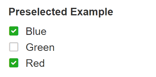
Selected Property - Specified a Boolean value column or property of the returned data which indicates if the entry should be preselected.
An example query to illustrate preselected values is below.
select 'Red' [color], 1 [selected]
union
select 'Green' [color], 0 [selected]
union
select 'Blue' [color], 1 [selected]
With the above example query, and choosing 'selected' as the "Selected Property", then the widget will load all three entries above with 'Red' and 'Blue' preselected.
# Comments
The Comments Widget provides for interactive commenting. Context for the widget is defined as needed and can be dynamic, meaning comment widgets can be scoped to topics as they arise. Examples would be a project by name, case number, order number, ticket number or other. Comment widgets can be paired with a supporting data workflow to perform additional activities, including mentions by email, enforcing any needed rules, or performing integrations.
An Entity ID and Entity Type determines the “subject” for the comment widget. This data structure resides in the application database. Entity ID for a comment widget is established by a specified URL parameter by name.
The system setting ENABLE_REQUEST_HISTORY_COMMENTS enables the Comments Widget on the Request History details page.
Common
Display Name – Provides a text label for the widget which is used as the displayed name while viewed in both the layout design and view pages.
Mapping Name - Provides and internal name which is referenced by the global options Disable If and Show If.
Comments Config
Save Comment: This is an optional configuration to provide a custom or override method to capture and store new comments entered into the widget. When a new comment is entered into this Comments Widget instance, this property will be used if set.
Enable File Upload - Enables a button to upload an attachment.
Relative Date Format - Formats dates relative to today.
Style Attachment Button - Requires "Enable File Upload". This option allows the attachment button to be styled.
Style Post Button - Option to style the post button.
Entity ID - This option defines the name of the URL parameter which will contain the entity ID to relate the comments
Comments Thread Header - Customize the text for the header which appears above the comments section.
Encrypt Comments - When data encryption is enabled this option will be available to allow comments to be encrypted.
Enable Edit - allow edits to be submitted for comments by submitting user
Enable Reply - allows a single level of threaded replies to be made on comments. Note – this will require HTML Template updates in Comments widget.
# New Comment Workflow
Offline Notifications and custom behaviors, or other activities can be provided by a configured workflow which will receive submitted comment information which can be processed as required.
# Mentioning
This optional feature leverages a data workflow which provides a list of individuals to mention when the user types the ‘@’ key to find individuals when commenting.
Workflow – defines an optional workflow which will be ran when new comments are submitted. The specified workflow should have the below named variables to receive data from the widget.
theComment – recieves the text of the text
entityId – recieves the related Entity ID for the comment widget
entityType - recieves the related Entity ID for the comment widget
Mention – defines an optional workflow which can return a list of matched identities for the widget. The data workflow should have the below named input variables to receive input from the widget and should term – string variable which is the search string from the @ mention feature used in the widget
The mention workflow should return a data table with the following columns for the mention widget.
firstname – the first name of matched user
lastname – the last name of the matched user
user_logon – the user logon of the matched user
ntlogon – the windows nt logon style ID for the matched user
Advanced Options
HTML Template - Provides an option to customize the template for rendering a comment. The HTML Template supports Mustache templates (Mustache Template Guide) or for more info see https://mustache.github.io/ for the layout.
Enable Custom Comments Data - This option enables the Custom Comments Datasource which will allow custom data to be set in the comments section of the widget.
Custom Comments Data - The data source which allows custom data to be retrieved from either a workflow or directly through SQL. The datasource will not appear unless the option "Enable Custom Comments Data" is checked.
An example SQL query is below which loads the comments from an external table.
SELECT C.id, C.Comment [theComment], C.CreateDateUTC [createdOn], P.FirstName + ' ' + P.LastName [UserName], P.Title, P.Department, P.[Image]
FROM Comment C
LEFT JOIN Person P ON P.Id = C.CreatedById
WHERE C.CaseId = {{CaseId}}
ORDER BY C.CreateDateUTC DESC
An example row returned by the above query
{
	"id": id_value,
	"theComment": "theComment_value",
	"createdOn": "createdOn_value",
	"UserName": "UserName_value",
	"Title": "Title_value",
	"Department": "Department_value",
	"Image" : "image_value"
}
The above data row has it's columns matched up with the HTML template's mustache variables. In this example, the column "theComment" needs to match the template variable {{theComment}}
<li class="media comment-container" data-id="{{id}}">
	<div class="media-body">
		<h4 class="media-heading">{{UserName}}<small>{{createdOn}}</small></h4>
		<div class="comment-text">
			{{theComment}}
		</div>
	</div>
</li>
# Date
The Date Widget provides a calendar input. Options for the widget are below.
Common
Display Name – Provides a text label for the widget which is used as the displayed name while viewed in both the layout design and view pages.
Mapping Name - Provides and internal name which is referenced by the global options Disable If and Show If.
Basic Options
Minimum Number of Days in Future – specifies how many days out in the future are required to be a valid date selection
Maximum Number of Days in Future – specifies the maximum number of days into the future are valid for selection
Weekdays Only – Specifies only M-F as valid
Restrict Free Text – allow user to type the date
Datasource - allow a date to be prepopulated from a datasource. Data sources which return multiple rows will only use the first row of the specified column. Supports ISO_8601, RFC_2822, and month/day/year formats.
Value Property – For dynamic data sources, the column ID to use for the select values. If this is blank, the first column will be used from the data source.
# Date Range Picker
Provides for date range selection. Options for the widget are below.
Common
Display Name – Provides a text label for the widget which is used as the displayed name while viewed in both the layout design and view pages.
Mapping Name - Provides and internal name which is referenced by the global options Disable If and Show If.
Ranges – Provides quick range selection options. Choices are Today, Yesterday, Last 7 Days, Last 30 Days, This Month, Last Month
Default Date Range – specifies a default selected range when displaying the choice to the user
Default Days – The number of days to pre-select from today
Open Direction – The default direction to open and display the date selection control
Show Month/Year Dropdowns – provides a select list of month and year selections
Show Time Picker – allow the user to select time of day
Single Date – Restrict the selection to a single date
# Dual List
The Dual List Widget provides an interface for the end user to select one or more values from a provided list into a new list.
The widget has the following properties.
Display Name – Provides a text label for the widget which is used as the displayed name while viewed in the layout design page.
Mapping Name - Provides and internal name which is referenced by the global options Disable If and Show If.
Data Source - The source of data for the widget
Height - Specifies the height, in pixels, for rendering the widget.
Selected Property - Intended to be used with a column containing Boolean values (true/false/0/1). Rows containing the value true or 1 will automatically be added to the destination list on the right hand side of the widget.
Value Property – For dynamic data sources, the column ID to use for the select values. If this is blank, the first column will be used from the data source.
Display Property - The property of the data set record which will be used for the display text. Setting a value for "Item Template" will override this setting.
Item Template - This property allows the item template to be modified with CSS/HTML. In the following example, a data source returning data containing the column "Name" can have it's template modified making each item display in an h1 tag with the text color set to blue.
<h1 style="color:blue;">{{Name}}</h1>
# Event Monitor
The Event Monitor widget allows for messages to be received from the Message Hub, providing for asynchronous design patterns for apps. This widget is not visible. Instead, it receives messages from workflows which are using the “Send Message To Hub” action. With this action, workflows can message apps that some event has occurred. The Event Monitor widget can then display “toast messages” received from the message, as well as trigger other widgets to refresh. This widget has the following properties.
The data sent with each message becomes the value of the widget to drive real-time updates in other widgets when using the Event Monitor as a data source.
Common
Display Name – Provides a text label for the widget which is used as the displayed name while viewed in the layout design page.
Mapping Name - Provides and internal name which is referenced by the global options Disable If and Show If.
Event Monitor Config
Message Key – The key to receive messages from the Message Hub. Message Keys can also include URL parameter based values by their name with the following example syntax:
{{execution_id}}
Additionally, You can use -message in the Message Key to limit event hub messages to be user specific. This helps control updates in the UI to specific user vs. any user on the application.
Target Widget – The widget to trigger to refresh when a message is received
Display Notification – Messages received from the hub will be displayed as toast notifications in the app
Advanced
Throttle - Time in milliseconds before the Event Monitor will process a subsequent message
# File Upload
The File Upload widget allows files to be uploaded, downloaded, and deleted. Files are linked to both the application page and the specified URL parameter. The default URL parameter is entity_id which can be modified on the application's edit page. Downloading and deleting files is locked by the page's permissions.
Common
Display Name – Provides a text label for the widget which is used as the displayed name while viewed in both the layout design and view pages.
Mapping Name - Provides and internal name which is referenced by the global options Disable If and Show If.
File Config
Enable File Explorer - Checkbox which enables a file explorer button allowing users to upload files from their local file system.
Enable Delete Confirmation - Alert Title and Alert Message control the delete confirmation
Draft Mode - Saves the files in the database table with a draft flag = 1. The files have to be saved with window["widgetguid"].saveFiles() for the files to be maked as saved or draft = 0. Draft files won't be shown to the user if the page is refreshed without saving.
Current Session Mode - Uploaded files will only be shown when the user uploads the files. If the user refreshes the page the files will no longer be shown.
Encrypt Files - When enabled, this option will encrypt the file's bytes before they are saved to the database.
Restrict to Page - Enabled by default. This option restricts the uploaded files to the current application page and is used in conjunction with the entity id (URL parameter). Disabling this option will remove the ability to use the application page's permissions to restrict downloading files.
Allowed File Types - This property limits the allowed file types which may be uploaded. Accepts a comma separated list of file extensions. Leave this property blank to allow all file types.
Max File Size (KB) - This property limits the allowed file size which is measured in kilobytes (1024 kilobytes = 1 megabyte).
Max Number of Allowed Files - Sets a limit to the maximum number of files allowed to be uploaded. Leave this option blank to remove the limit.
File Name Max Character Length - Sets a limit to the maximum number of characters allowed for an uploaded file's name. The file path is included in the maximum number of characters. For example, test.txt contains a length of eight character. Leave this option blank to remove the limit.
Entity ID - Required. This property allows the URL parameter name to be specified which will contain the entity ID to be stored with the files, which will associate the files back to an entity instance. This will be the URL parameter on the application's view page. The page's view URL must contain this URL parameter as well as a value. Example URL Parameter using the default value:
/sc/app.embed.aspx?app=myApp&entity_id=myId
Example URL Parameter using a custom value:
/sc/app.embed.aspx?app=myApp&my_custom_value=myId
Advanced
File HTML Template - Allows the file's HTML template to be modified. Pressing Ctrl+Space brings up a list of available variables which may be used within the template.
Supported variables include:
- entity_id
- file_extension
- file_id
- file_name
- file_size
- file_type
- upload_date
- uploaded_by
- user_firstName
- user_lastName
No Data HTML Template - Allows the widget's no data template to be modified.
On Insert/Delete - Specifies a workflow which can handle custom insert and delete functionality.
The selected workflow must contain the variables:
- fileId
- action
When a file is either inserted (action = insert) or deleted (action = delete) the workflow will be called and the variables will be passed along with their corresponding values to allow for further custom processing.
# Form
The Form Widget will load a selected Form into the app. Options for the widget are below.
Common
Display Name – Provides a text label for the widget which is used as the displayed name while viewed in both the layout design and view pages.
Mapping Name - Provides and internal name which is referenced by the global options Disable If and Show If.
Description – A text description of the form
Form – The form to display
On Submit – Controls the behavior on form submission. Options are below
Show Details Link – loads a link to view more details about the submitted form. To be used when paired with a form submitted workflow
Go to Details Page – On submit, reload the page showing the detailed view of the submitted form’s workflow
Reload Page – refresh the current page
Reset Form – clear current form data
Advanced
On Submit – Override JavaScript to run on submit. For example, if the form widget is being displayed in a modal, the below would hide the modal on submit.
$('#myModal').modal('hide') //myModal being the ID for the element
Submit Complete – Override JavaScript to run when submit complete
URL Parameters can be passed to form questions but the parameter product_id must exist in the app page URL.
# Heading
The Heading Widget is a text display widget which displays using CSS headings. Options are below.
Display Name – Provides a text label for the widget which is used as the displayed name while viewed in both the layout design and view pages.
Mapping Name - Provides and internal name which is referenced by the global options Disable If and Show If.
Size – the CSS heading size
Alignment – CSS alignment for the heading text
# HTML
The HTML Widget provides for custom display of HTML or data from a specified data source. The HTML supports Mustache templates (Mustache Template Guide) or for more info see https://mustache.github.io/ for the layout. Options for the widget are below.
Common
Display Name – Provides a text label for the widget which is used as the displayed name while viewed in the layout design page.
Mapping Name - Provides and internal name which is referenced by the global options Disable If and Show If.
Basic
HTML Template – HTML and optional Mustache https://mustache.github.io/ to render the widget
Data Source – specifies the data source for the widget
Advanced
Run Datasource on Load – Determines if the widget should load data on initial draw
Use Container Div – Specifies if the container div should be used
# Inbox
The Inbox Widget provides access to the user’s tasks.
Common
Display Name – Provides a text label for the widget which is used as the displayed name while viewed in both the layout design and view pages.
Mapping Name - Provides and internal name which is referenced by the global options Disable If and Show If.
# Link
The Link Widget will render a web link. Options for the widget are below.
Common
Display Name – Provides a text label for the widget which is used as the displayed name while viewed in both the layout design and view pages.
Mapping Name - Provides and internal name which is referenced by the global options Disable If and Show If.
Basic Options
App/URL – Allows the link to open an App or a URL
Icon – a CSS icon for the link
New Window – Open the link in a new window
List Item – apply the List Item class to the link
Class – specify an override CSS style to the link
# Menu
The Menu Widget provides for an embedded menu with links within the app. The widget provides the following options.
Common
Display Name – Provides a text label for the widget which is used as the displayed name while viewed in both the layout design and view pages.
Mapping Name - Provides and internal name which is referenced by the global options Disable If and Show If.
Basic Options
Icon – a CSS icon for the menu
Render as navbar – sets the CSS navbar class
Menu items
Click “+Link” to add a new menu item to the widget. Options for the link are below
Text – A text label for the menu item
App / Url – determines if the link will load another app or some other URL. If App, select an app from the list provided. If URL, specify the URL
Icon – A CSS Icon for the item
New Window – determines if the link will open in a new window
List Item? – determines if the item will be set as a list item for CSS
# Milestone
The Milestone Widget will display the respective milestones for a submitted request or workflow instance. Options for the widget are below.
Common
Display Name – Provides a text label for the widget which is used as the displayed name while viewed in the layout design page.
Mapping Name - Provides and internal name which is referenced by the global options Disable If and Show If.
Basic Options
Order Number – The request order number
Workflow ID – The workflow ID
Live Update – determines if the widget will refresh as milestones occur
# Navigation
The Navigation Widget will display the standard PMG Portal navigation which provides links to personal information, reports, and cart.
Common
Display Name – Provides a text label for the widget which is used as the displayed name while viewed in the layout design page.
Mapping Name - Provides and internal name which is referenced by the global options Disable If and Show If.
# Radio Button
The Radio Button widget provides for a radio button control. Options for the widget are below.
Common
Display Name – Provides a text label for the widget which is used as the displayed name while viewed in both the layout design and view pages.
Mapping Name - Provides and internal name which is referenced by the global options Disable If and Show If.
Basic Options
Number of Columns – the number of columns to use in the display of the radio button values
Data Source – in addition to standard data source options, Static List may also be specified. The list is a set of comma-separated values
Value Property – For dynamic data sources, the column ID to use for the select values. If this is blank, the first column will be used from the data source.
Display Property – For dynamic data sources, the column ID to use for the radio button selection text
# Ratings
The Ratings Widget provides a configurable user interface for defining star/bar selectable ratings. The widget is driven by a select list whose values are defined by either a static list of comma separated values, or dynamically through a configured data source.
Common
Display Name – Provides a text label for the widget which is used as the displayed name while viewed in both the layout design and view pages.
Mapping Name - Provides and internal name which is referenced by the global options Disable If and Show If.
Type - Defines the theme for styling the ratings widget.
Show Values - This option will display the value within each selectable star/bar.
Show Selected Rating - This option will display the users selected value.
Reverse - Option to reverse the fill direction when selecting options.
Data Source – in addition to standard data source options, Static List may also be specified. The list is a set of comma-separated values.
# Request History
# Request Summary
The Request Summary widget displays the questions and answers for a submitted request. This widget is linked to a Request History widget by setting the "Details Page" property for the Request History widget to the page which contains the Request Summery widget.
Request History "Details Page" property which specifies the application page containing the Request Summary widget.

When a request row on the Request History widget is selected, the user is automatically transferred to the page which was specified by the Details Page property. The primary use case is to setup two pages. One page which contains a Request History widget, and another which contains a Request Summary widget. The required URL parameters are automatically added when a request row is selected.

The request to be shown is controlled by the URL parameters order_id and execution_id. The URL parameter order_id refers to the parent request id, and the parameter execution_id refers the the child request id. For example, a master request #37-1580 has a order_id of 37 with a execution_id of 1580, where 37 is the parent's request id and 1580 is the child's request id. Options for the widget are below.
Display Name – Provides a text label for the widget which is used as the displayed name while viewed in both the layout design and view pages.
Mapping Name - Provides and internal name which is referenced by the global options Disable If and Show If.
Use Latest Responses – indicates that the latest values submitted to the questions will be displayed
# Rich Text
The Rich Text widget allows for display of rich text as a widget. The widget properties allow for defining the rich text (HTML) using a rich text editor.
Properties for this widget are below.
HTML Template - provides a rich text editor in a window to set the information to be displayed
Use Container Div - indicates the displayed information should use the container div
Minimum Height (px) - a minimum height in px to display the widget
# Rich Text Editor
The Rich Text Editor widget allows for the end user to enter rich text (HTML) within an App. Properties for this widget are below.
Menu Bar Size - The size to use for the displayed menu bar
Enable Status Bar - Enables the status bar control for the RTE for resizing and HTML selection
Convert plain text linebreaks and tabs to HTML - If the user enters plain text with tab characters and linebreaks, the text will be converted to matching HTML.
# Search
The Search Widget provides a platform content search which includes Services, Knowledge Articles, Documents, etc. Options for the widget are below.
Common
Display Name – Provides a text label for the widget which is used as the displayed name while viewed in both the layout design and view pages.
Mapping Name - Provides and internal name which is referenced by the global options Disable If and Show If.
Basic Options
Drop Down – Controls the display format to be a dropdown list or a page display
Group Selection – Allows end users to filter the search by a group type. i.e. Services, Categories, etc.
Enable External Providers - Allows search providers to be included in the search results.
Disable Default Sources - Allows app designers to disable search for group types.
Enable Max Items per Group - Controls the max number of rows returned per group type.
Open Selection in New Tab - Opens the selected search result in a new tab.
Search Result Page - Controls where the user is directed when selecting a search result. Default is /SearchResults.aspx.
Advanced Result Item Template – The custom HTML and Mustache https://mustache.github.io/ layout to use for the displayed results
Enable Footer Template - Displays a footer template displayed in the search results dropdown.
# Select
The Select Widget provides for a radio button control. Options for the widget are below.
Common
Display Name – Provides a text label for the widget which is used as the displayed name while viewed in both the layout design and view pages.
Mapping Name - Provides and internal name which is referenced by the global options Disable If and Show If.
Basic Options
Select Multiple – Allows multiple entries to be selected
Close on Select - For multi-select mode, this option will close the options dropdown when an item is selected
Enable Tooltip - Provides a tooltip message for the control
Enable Full Width - Indicates the select list should use the full containing div width for display
Add blank option - for single select mode, adds a blank option
Disable search - for single select mode, disables the search input
Minimum Search Length - For searching with single select, determines the minimal number of characters required to perform a search
Placeholder - Specifies the placeholder text for the type-ahead search filter
Run Datasource on Load - Determines if the widget should run the Datasource for values on initial load, or wait until some trigger, e.g. another widget event
Data Source – in addition to standard data source options, Static List may also be specified. The list is a set of comma-separated values
Default Value – Allows default values to be selected. This property has the following options.
Use URL Parameters - queries can leverage parameters passed by URL with the following syntax
{{ParamName}}
so that given a URL parameter is provided in the page load e.g. &FavoriteItem=Movies , then the value "Movies" would be used in place with a query like
select {{FavoriteItem}}
# Select Widget Query Example
In the following example, we will configure a multi-select list showing 'A', 'B', 'C', along with some fourth parameter display from a URL parameter, and then both 'A', and 'B' will be preselected on load.
The below query for "Default" is for type "SQL". The values returned here will determine default values to be selected select list query. Matches are based on the values matching on 1 and 2 per below.
select 1
union
select 2
With the above query, you can click the "Load Data" button to preview the return data, which will be displayed as below. Note the default provided name of the column as 'Column1'. This column name is then used in the select list query for the select list values.
{
  "Column1": 1
}
Then for our select list, we will provide a SQL query like below.
select 1 [value], 'A' [display]
union
select 2 [value], 'B' [display]
union
select 3 [value], 'C' [display]
union
select 4 [value], {{FavoriteItem}} [display]
To use the default values from our above query, set the option "Default Value Property" to "Column1". Given the query for default values, 'A' and 'B' will be preselected as their respective values are '1' and '2'.
Trigger Workflow – Executes a workflow when an option is selected. The value of the select list is passed into the specified workflow variable. URL parameters are also supported
Value Property – For dynamic data sources, the column ID to use for the select values. If this is blank, the first column will be used from the data source.
Display Property – For dynamic data sources, the column ID to use for the select items display text
# Services
The Services Widget allows for displaying one or more categories of services from the catalog. Options for the widget are below.
Common
Display Name – Provides a text label for the widget which is used as the displayed name while viewed in both the layout design and view pages.
Mapping Name - Provides and internal name which is referenced by the global options Disable If and Show If.
Basic Options
Service Group – One or more categories to include in the display
Records Returned - Limits the returned results to no greater than this value.
HTML Template – a custom HTML and Mustache https://mustache.github.io/ layout for the results
# Set Favorites
(Beta/Global)
The Set Favorites Widget provides a clickable button to allow the end user to add the current URL to a list of personal favorites. It is used in conjunction with the View Favorites Widget to view and transition to previously saved URI's.
Common
Display Name – Provides a text label for the widget which is used as the displayed name while viewed in the layout design page.
Mapping Name - Provides and internal name which is referenced by the global options Disable If and Show If.
Basic Options
Icon Favorited - Sets the icon to be displayed on the widget when the current URI is favorited.
Icon Unfavorited - Sets the icon to be displayed on the widget when the current URI is not favorited.
Icon Color - Sets the color of both favorited and unfavorited icons.
Exclude - This string value, when contained within a URI, will exclude the set favorites widget from appearing.
# Switch
The Switch Widget displays a switch control. The switch states support values which may be used by other widgets. Options for the widget are below.
Common
Display Name – Provides a text label for the widget which is used as the displayed name while viewed in the layout design page.
Mapping Name - Provides and internal name which is referenced by the global options Disable If and Show If.
Basic Options
Switch value #1 – The value of the switch in its initial state
Switch value #2 – The toggled value of the switch
Switch color #1 – The CSS color of the switch in its initial state
Switch color #2 – The CSS color of the switch in its toggled state
# Table
The Table Widget allows for table based user interaction with data. The below options are for viewing data. For additional options for editing data, see the section Table Widget Editing Features below.
Common
Display Name – Provides a text label for the widget which is used as the displayed name while viewed in both the layout design and view pages.
Mapping Name - Provides and internal name which is referenced by the global options Disable If and Show If.
Description – Descriptive text to show with the displayed table
Basic Options
Excel Export – Provide a link to download table data to Excel
Search – Provide a search filter for the data
Column Selector – Allow the user to select columns to show and hide
Table Condensed – indicates if the table should be displayed with condensed layout
Format Dates – If the column name has “date” in it, the value will be shown as a formatted date
Show Paging Message - Provides an option to enable/disable the paging message ("showing 1 to n of m entries"), at the bottom left corner of the widget.
Paging – provides paging controls for the displayed data
Sorting – provides sorting controls for the displayed data
Striped Rows – determines if the rows should be displayed with alternating color
Select Rows – Allows the user to select a single row or multiple rows
Page Results Options - Allows the user to define custom paging options using comma separated values.
Default Results Per Page - Sets the default page results option. If no value is set, the default option is the first valid value from the Page Results Options.
Data Source – Specifies the data source to use for the table
Table Config
Sort By – specifies a column to default sort the displayed table data
Hide Columns – a list of columns to hide from the displayed data
Advanced Options
Link Column Name – Specifies a table column ID to render as a link
Link Column Template – Custom HTML and Mustache https://mustache.github.io/ to render the column data as a link
Column Definitions – A custom Datatables JSON document to control the behavior of the displayed table.
Button Config – Provides for a button control per displayed row with JavaScript based click code
Text – a text label for the button
Style – a CSS style for the button
Size – a CSS size for the button
Icon – a CSS icon for the button
Click Event – JavaScript to execute on button click. The script has access to item.___ where ___ is the respective column name in the selected row. For a table with a column named “Model”, this script would display the row’s value of Model when the button is clicked.
alert(item.Model);
# Table Widget Editing Features
The Table Widget supports editing of the underlying data. Options include creation of new records, deleting records, and updating records. As the Table Widget only displays data and provides related management links, the various data management activities are defined and accessed from a supporting data workflow, which are called by the widget. See more below for details on creating a supporting data management workflow.
Supporting data workflows should have these reserved variables declared to receive information from the Table widget.
# Data Editor Workflow Reserved Inputs
_action : a string variable to hold the requested data activity. Values are insert, update, delete, and ReadAll
_inputData : an XML serialized string containing the details of the impacted row in the table. An example is below.
<_object>
  <_Id>61119d7f8b87bc2f20ceff40</_Id>
  <Col1></Col1>
  <Col2></Col2>
  <Street></Street>
  <Zip>0</Zip>
  <myCol></myCol>
  <State />
</_object>
Linked below are importable example data and supporting workflow and example Record Collection to support editing activities with a Table widget.
| Resource Links | |
|---|---|
| Workflow.EditDataTable.xml | Example supporting workflow to manage record data |
| TestTable.FullMigration.2021-10-13.json | Example record collection for the app and workflow |
| EditDataTable.json | Example App to load the table widget for editing |
Options for data management are below.
Enable Delete - Enables a delete link for rows displayed in the table. 
Enable Editor - allows for rows of data and allowed columns to be edited inline within the table widget.
Editor ID Column - determines which column from the data will be used as the ID when interacting with the supporting workflow.
Read Only Columns - determines which columns will be shown as read-only, non-editable in the table widget.
Editor Data Source - specifies the workflow which will be used to process the edits. This workflow should define the variables to receive details from the table widget, _action and _inputData per Data Editor Workflow Reserved Inputs, above.
# Outbound messaging for Data Editor Workflow
Some activities submitted to a data editor workflow require result details, containing information for successful transactions, such as a new record ID for an insert request, or failure details in the event of some error. The Table widget looks for these responses and will display relevant information to the end user, and refresh data as needed.
To provide information to the Table widget from the data workflow, use the "Set String Output" action with a JSON document containing details about the transaction.

You can create a response document for the Set String Output by using the "Set JSON Object Fields" action. An example is below. Proper response documents are important as they will alert the Table widget what action to take after the request. For example, if a delete is successful the row should be removed. Or if the delete encounters an error, the row should remain as displayed.
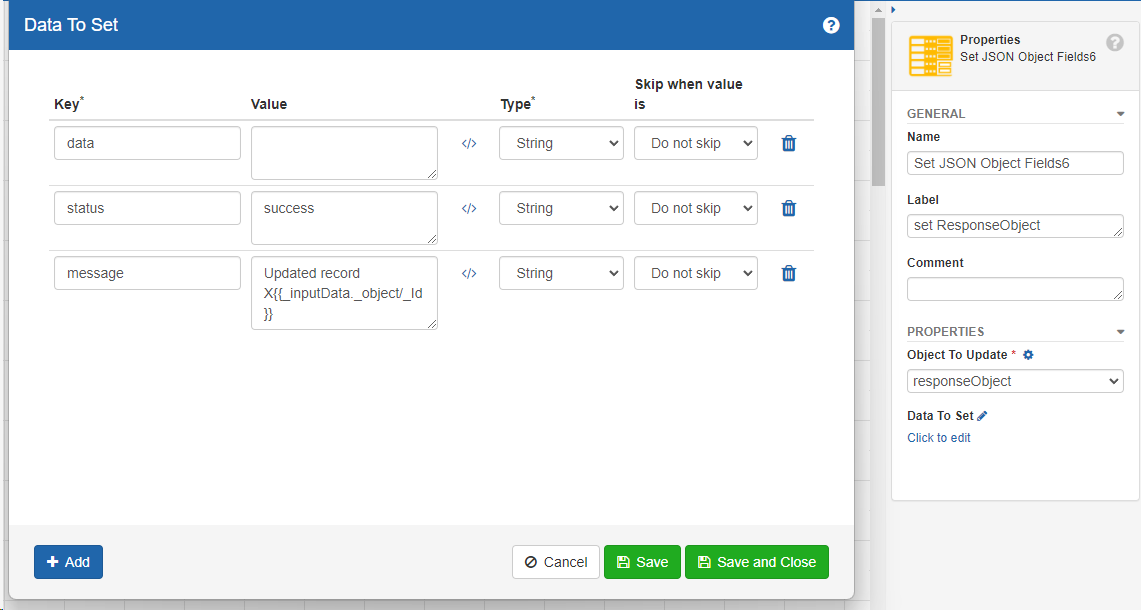
Responses should contain these fields.
| Field | Purpose |
|---|---|
| data | contains the newly created ID for an insert activity |
| status | indicates success or error |
| message | Contains a detailed message about the success or error |
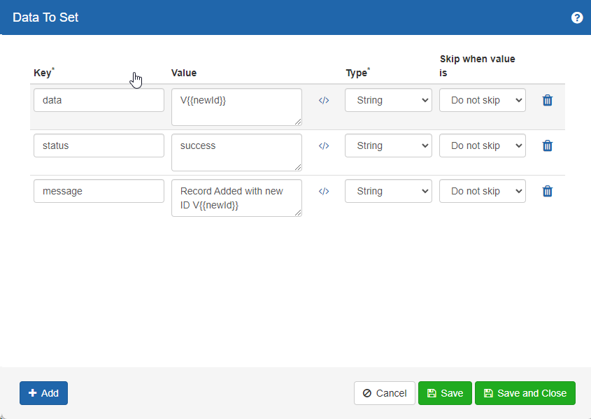
An example response for a new record is below.
# Text Input
The Text Input Widget displays a text input control. Options for the widget are below.
Common
Display Name – Provides a text label for the widget which is used as the displayed name while viewed in both the layout design and view pages.
Mapping Name - Provides and internal name which is referenced by the global options Disable If and Show If.
Basic Options
Single Line / Multi Line – Determines if the text input is single line or multi-line
Password – Determines if the control should display with * for the input text (treating as password)
Number of Lines – controls the number of lines to use when multi-line
Enable Tooltip - Provides optional tooltip text for the input displayed to the user
Data Source – allows the text input to default to a value loaded
Value Property – For dynamic data sources, the column ID to use for the select values. If this is blank, the first column will be used from the data source. This property is only visible if a data source is being used.
Input Validation - provides an optional text input validation option using regular expressions. **Format provides a list of common regular expressions. Use Custom Validation provides an option to provide a value for a custom regular expression to use for validation.
Input Test - provides a simple input box where the form designer can quickly test or validate inputs based on the regular expression
# Tile
The Tile Widget displays a summary tile for a data source and provides conditional formatting and display based on the data source values. Options for the widget are as follows.
Common
Display Name – Provides a text label for the widget which is used as the displayed name while viewed in both the layout design and view pages.
Mapping Name - Provides and internal name which is referenced by the global options Disable If and Show If.
Description – A text description to display with the tile
Basic Options
Value Type – Count or Value, determines if the tile will show the count of the data source results or the value in the data source result
Conditions – a JavaScript Mustache expression which when matched for the tile value will control the CSS for the tile. Success, Warning, and Error control the matches that can be returned to control the display
Example conditions are below
{{value}} < 5

{{value}} >= 5 && {{value}} < 20

{{value}} >= 20
No Results Display Message – text to use within the tile when no data is returned
Target Column – For dynamic data sources, the column ID to use for the select values. If this is blank, the first column will be used from the data source.
# User Lookup
Beta status
The User Lookup Widget provides end users the ability to search users and/or groups from within a user/group directory, either from Active Directory, External Groups, or a custom data source.
User Data Source – Options are below:
Domain - The source of the users and groups will be provided by a defined Active Directory, LDAP, or External Group source
Datasource - The source of the users and groups will be provided by a custom datasource and provided queries. If Datasource is selected, the "DATASOURCE" property will be shown for the widget, allowing for configuration of the data connection details.
Search Type - Specifies what to allow the end user to search. Options are User, Group, or Both
Results Property - Determines which object property will be used as the value for the selection. When the User Data Source is "Domain", options are AD Object ID, Type, or Text. When the source is "Datasource" this is the name of the column to use for the result. Leave this blank to return all the properties for the selected entry.
Value Property - When the source is "Datasource" this is the column to use as the value for the selected entry value for the widget
Display Property - When the source is "Datasource" this is the column to use as the value for the matched entries display text
# Migrating Apps
See Package Manager for information on migrating Apps
# Widget Localization
App designers can reference site text and localized text in the names and templates of widgets. To do so, you need to reference the site/localized text message ID using the following syntax:
L{{L_Request_History}}
On page load, the value will automatically replace the message ID with the correct value based on the end-users browser preferences.
# Mustache Template Guide
Apps and Widgets using HTML for layout have available the Mustache binding libraries. See https://mustache.github.io/ for additional information about this library. This binding library can assist in the drawing and layout of various data sources including Data Workflows or Reports.
# Accessing properties
Use a property name to access the value of a property, and use "dot" notation to access nested properties.
Data
{
    "name": "John",
    "address": {
        "state": "Georgia",
        "city": "Atlanta"
    }
}
Mustache Template
Result
John is from Atlanta
# The "section" tag (#)
Mustache has the ability to enter the scope of a property in your data using "section" tags, which can simplify using nested properties.
"Section" tags must be opened with the "#" symbol and closed with the "/" symbol
Data
{
    "name": "John",
    "address": {
        "state": "Georgia",
        "city": "Atlanta"
    }
}
Mustache Template
Result
John is from Atlanta, Georgia
# Using "section" tag as a Conditional
The "section" tag can check whether a value is true or false. Using the "#" symbol will check if the value is true, and using the "^" symbol will check if the value is false.
Data
{
    "name": "John",
    "hasAccount": true,
    "expired": false
}
Mustache Template
Result
John has an account
The account has not expired
# Lists (Arrays)
You can iterate an array by using the "section" tags on an array. The template inside the "section" tags will be printed for each item in the array. You can access specific items in an array using dot notation along with the (zero-based) index of the desired item. Since this is a JavaScript array, we can access the "length" property to get the number of items in any array.
Data
{
    "members": [
        { "name": "John" },
        { "name": "Susan" }
    ]
}
Mustache Template
Result
The list contains...

John
Susan

The 2nd member is Susan

Count: 2
# The "current" item:
{{.}}
Use a single "dot" to access the current item.
Data
"Just some text"
Mustache Template
Result
Display the text: Just some text
# Advanced Mustache Templates
# Handling empty lists
Data
{
    "members": [ ]
}
Mustache Template
Result
No data found.
The length of members is 0.
# Using the "current" item to print a list of strings
Data
{
    "members": ["John", "Susan"]
}
Mustache Template
Result
The list contains...

John
Susan
# Using root-level arrays
Sometimes, your data is just an array without a parent JSON document. We can handle this using the "current-item" syntax combined with the "section" tags, which looks like this:
{{#.}} {{/.}}
Notice how the "length" property and the array indexes are available at the root level.
Data
[
    { "name": "John" },
    { "name": "Susan" }
]
Mustache Template
Result
The list contains...

John
Susan

The 2nd member is Susan

Count: 2
# Print a root array of strings using nested current-item syntax
Data
["John", "Susan"]
Mustache Template
Result
The list contains...

John
Susan

The 2nd member is Susan